We read all sorts of text daily, although most of us probably don’t think about the fonts those texts are using. But typography (the process of designing and arranging letters and words together to make the text clear and appealing) is actually a nuanced and intricate art that profoundly impacts the materials we read or create.
In this post, I’ll explain what elements of a font are important to consider for hymnals or other printed worship materials, and I’ll compare four fonts that I think work well in this context.
Width and Tracking
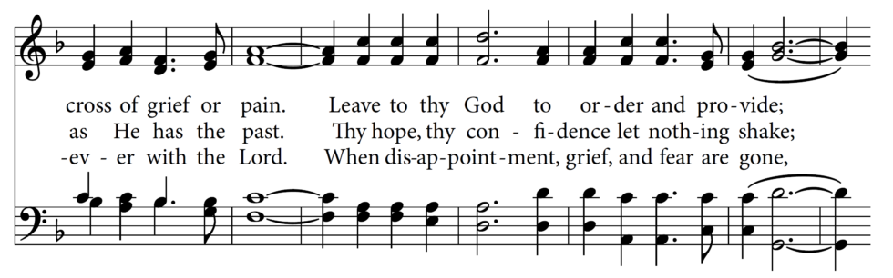
Without exception, hymnals work to place a large amount of information on the page, in an effort to limit overall page count. Furthermore, it’s always best to place entire poetic phrases on a single line of music when possible. When choosing fonts, it’s important to consider a font’s width (the width of its individual characters) as well as its tracking (the default spacing between characters). A desirable font should be somewhat compact without appearing cramped. A good rule of thumb is to be able to fit 14 syllables, or two phrases of Common Meter (86 86), on a single system (line) of music on a 6×9-inch page with a font size of 10 points.
x-height
Any well-designed font looks beautiful and legible at a size of 60 points, but hymnals don’t have that luxury. Hymnals typically usually use a font size of 8.5–11 points, and the most important quality they must possess is legibility. To this end, it’s helpful to select a font that has a large x-height. The x-height is the height of the lowercase characters in a font (specifically the x), and its proportion to the cap height. Here’s an example:
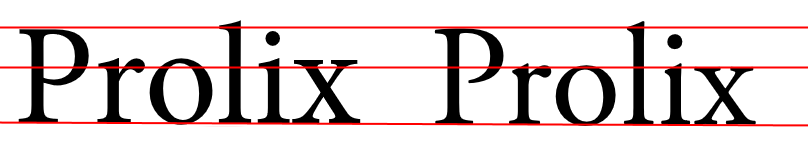
Minion Pro is on the left, and Adobe Garamond Pro is on the right. The red line at the bottom is the baseline, the top line is the cap height, and the middle line is the x-height. You can see that Minion Pro has a larger x-height than Garamond, which makes it more legible at small point sizes.
Stroke Weight
A font’s stroke weight is basically just a fancy way to describe how dark or thick it appears. If you’ve ever used a bold version of a typeface, you were choosing a variation of the font based on a thicker weight (technically, Arial is a typeface or font family, and Arial Regular and Arial Bold are actually different fonts). In general (though not always), it’s best to choose fonts with thicker weights.
Here’s a comparison of two fonts with different stroke weights:
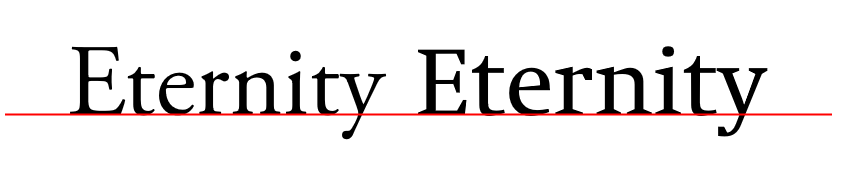
Adobe Garamond is on the left, and Swift LT Pro is on the right. You can see that Swift LT Pro has a heavier stroke weight.
Serifs
Perhaps the broadest classification of fonts is into serif and sans-serif fonts. Serifs are small projections or caps at the end of strokes. Here’s a comparison of a sans-serif font on the left (Arial) and a serif font on the right (Caslon OS):
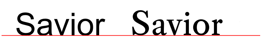
There’s not much to say here, except that you should never use a sans-serif font for printed lyrics. Also, the particular design of the serifs is one of the things that gives a font its unique character.
FONT COMPARISONS
Here are four fonts that I think work well for hymnals, ranked in order of preference. I’ve also included links to a hymnal page using each font, for comparison.
Minion Pro
Minion Pro is hand-down my preferred font for hymnals, and it’s what I use for the majority of hymnal projects I create for clients. The font is a beautiful balance of modernity and classic elegance. It has a large x-height and a consistent stroke weight that makes it dark and legible without being too thick. And its width and tracking are uniquely compact without appearing cramped. Minion Pro is not overly unique, but in my opinion, it’s the best.
Gentium Book Basic
Gentium Book Basic is very similar to Minion Pro. As its suffix suggests, it’s a very limited font set (no German characters, for example, and no small caps). It’s slightly heavier and appears more compact than Minion Pro, and its serifs give it a more distinct and modern character.
Swift LT Pro
Swift LT Pro is even more distinct than Gentium, with angular serifs and greater variance in stroke weight. It also has the largest x-height by far, making it look larger than it is; but it’s the widest of the four fonts listed here, making lyric spacing more difficult in situations where line width is an issue. Nevertheless, it’s an excellent font and can be used successfully at smaller point sizes than the others.
Libre Baskerville
Libre Baskerville is a contemporary variant of the classic Baskerville font, which dates back to the 1750’s. Of the four fonts here, Libre Baskerville gives the greatest impression of age (and has been voted the “most trustworthy” font). Though I put it last on the list, it’s still a solid “classic” choice for a hymnal.